Optimizing Images with the Next.js Image Component
Images often account for the majority of bytes downloaded on a webpage. Unoptimized images lead to slow Load times and Layout Shifts (CLS), killing your SEO and user experience. Next.js solves this with the <Image /> component.
The Problem with standard <img>
- Layout Shift: If you don't define explicit width/height, the page jumps when the image loads.
- Oversized Files: A user on a mobile phone shouldn't download a 4000px wide hero image intended for a 4K monitor.
- Legacy Formats: JPEGs and PNGs are larger than modern formats like WebP or AVIF.
The Next.js Solution (next/image)
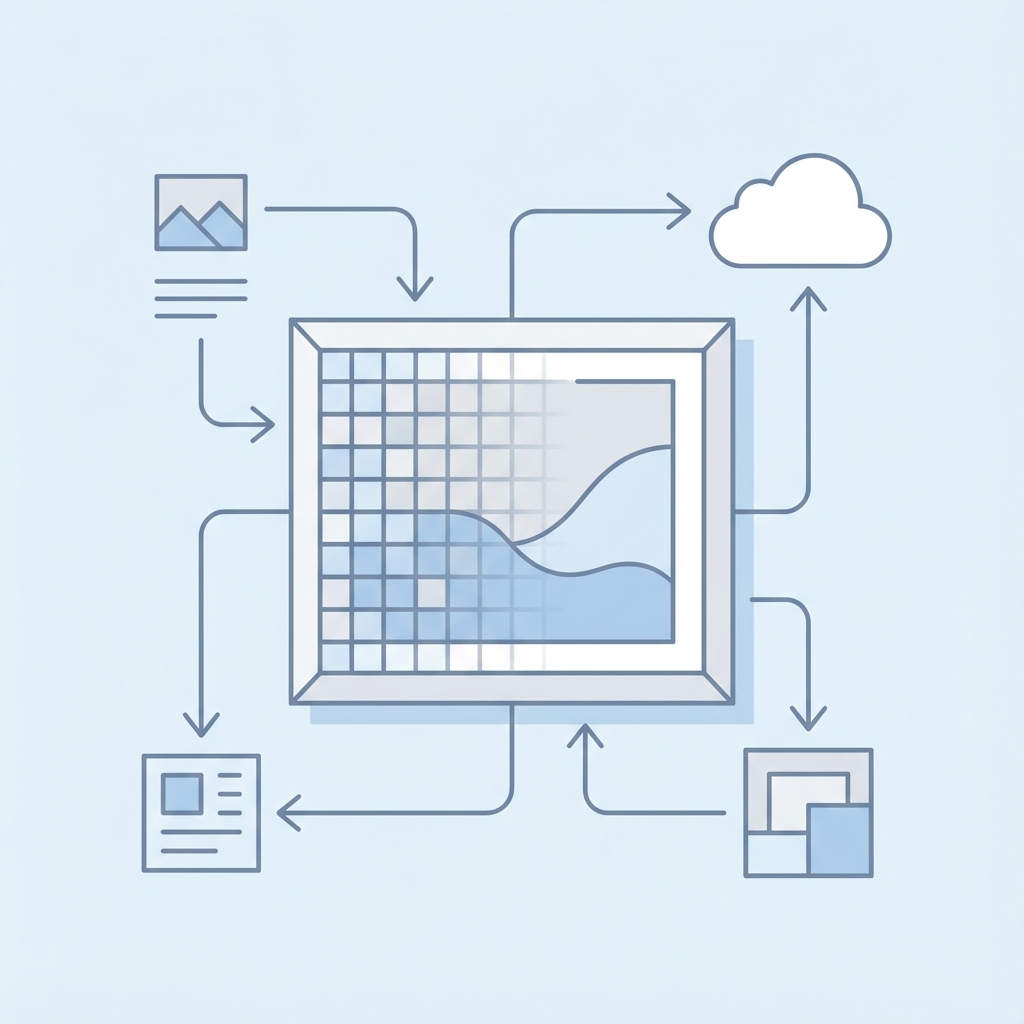
import Image from 'next/image';
import heroPic from '../public/hero.jpg';

<Image
  src={heroPic}
  alt="UI Dashboard Preview"
  placeholder="blur" // Instant loading effect
/>
Key Features
- Automatic Resizing: Next.js creates multiple versions of your image on the server. When a mobile user accepts the page, they get a small image. A desktop user gets the large one.
- Lazy Loading: Images below the fold are not downloaded until the user scrolls near them.
- Modern Formats: Automatically serves WebP or AVIF if the browser supports it.
- Visual Stability: Forces you to reserve space for the image, preventing layout shift.
Remote Images
If you are loading images from a URL (e.g., AWS S3 or a CMS), you need to define the dimensions explicitly to prevent CLS.
<Image
  src="https://example.com/image.jpg"
  alt="Remote Image"
  width={800}
  height={600}
/>
The fill prop
For responsive containers where you don't know the exact size, use fill.
<div style={{ position: 'relative', height: '500px' }}>
  <Image
    src="/hero.jpg"
    alt="Hero"
    fill
    style={{ objectFit: 'cover' }}
  />
</div>
Conclusion
Using next/image is one of the highest ROI changes you can make for performance. It abstracts away the complexity of responsive images, giving you a blazing fast site out of the box.