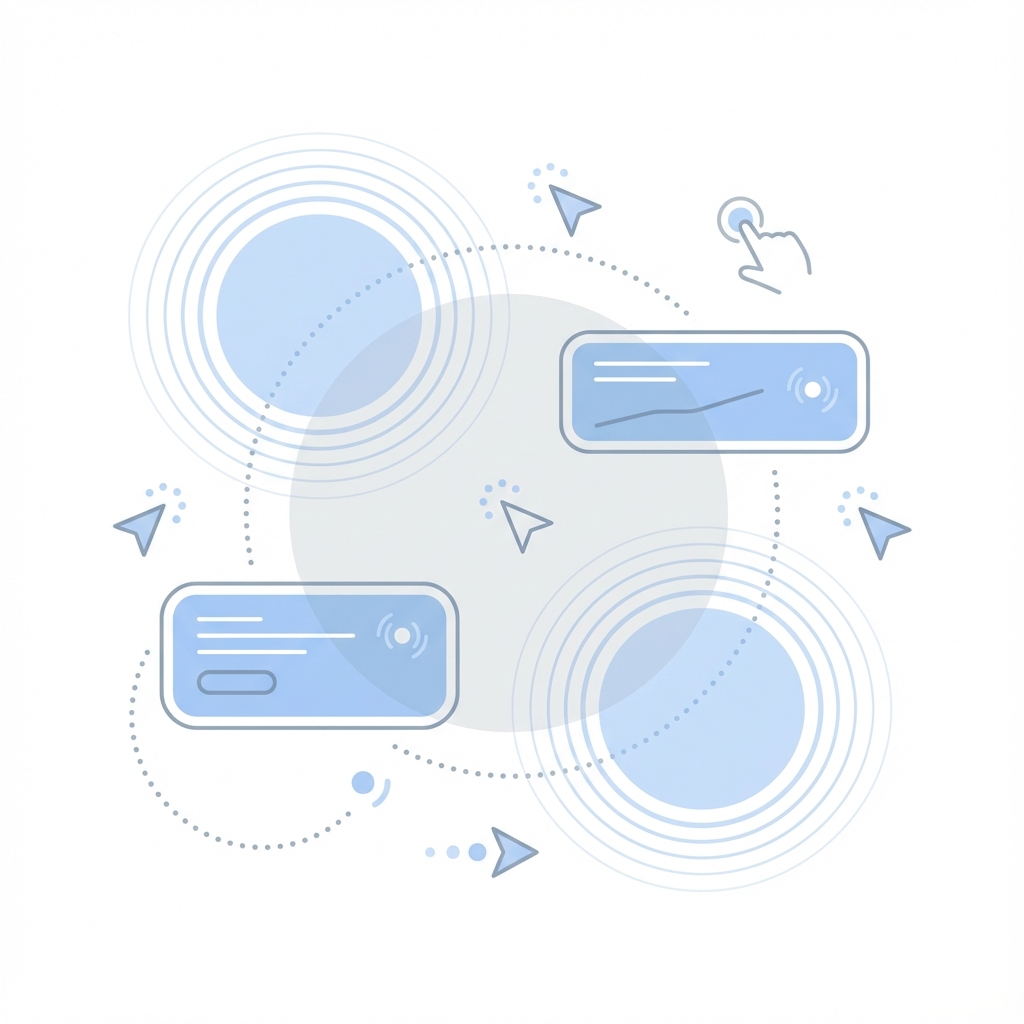
Micro-Interactions: Enhancing UX with Subtlety
In the world of UI Encyclopedia, the difference between a "good" interface and a "great" one often lies in the details. Micro-interactions are those subtle moments where the user and the interface communicate—a button click, a toggle switch, a loading bar, or a swipe gesture.
The Purpose of Micro-Interactions
They aren't just for show; they serve distinct functional purposes:
- Feedback: Acknowledging a user's action (e.g., a button pressing down).
- System Status: Showing what's happening (e.g., a skeleton loader or progress bar).
- Error Prevention: guiding the user (e.g., a shaking input field on invalid password).
- Brand Personality: Adding delight (e.g., the Twitter "Like" heart animation).
Tools for Implementation
CSS Transitions
For simple state changes (hover, focus), CSS transitions are performant and easy.
.button {
  transition: transform 0.1s ease-in-out;
}
.button:active {
  transform: scale(0.95);
}
Framer Motion
For more complex, physics-based animations in React, Framer Motion is the gold standard.
<motion.button
  whileHover={{ scale: 1.05 }}
  whileTap={{ scale: 0.95 }}
>
  Click me
</motion.button>
Designing Effective Micro-Interactions
- Keep it Fast: Interactions should feel immediate. 200ms-300ms is the sweet spot. Anything longer feels sluggish.
- Be Consistent: If one card lifts on hover, all cards should lift on hover.
- Don't Overdo It: If everything is moving, the user gets visually overwhelmed. Subtlety is key.
Case Study: The "Delete" Action
Imagine deleting an item from a list. Bad: The item instantly disappears. Did it work? Did I delete the right one? Good: The item fades out and slides away, the list collapses to fill the gap, and a "Toast" message appears with an "Undo" button. This flow confirms the action, visually explains the change, and offers a safety net.
Conclusion
Micro-interactions leverage human psychology to make digital products feel more tangible and responsive. They are the "body language" of your application.