Mastering Grid Layouts: The Backbone of Modern Web Apps
In the rapidly evolving landscape of web design, the CSS Grid Layout Module has emerged as a fundamental tool for creating robust, responsive, and visually striking user interfaces. As we delve into the world of UI Encyclopedia, understanding the nuances of grid systems is paramount for any developer or designer aiming to build production-ready applications.
Why CSS Grid?
Before Grid, we relied on floats, positioning, and Flexbox to hack together layouts. While Flexbox is excellent for one-dimensional layouts (rows or columns), CSS Grid shines in two-dimensional layouts—handling both rows and columns simultaneously. This capability allows for:
- Complex Asymmetrical Designs: Create layouts that break free from the standard 12-column structure.
- Responsive Adaptation: drastically easier media queries by redefining grid template areas.
- Cleaner Markup: Reduced need for nested wrapper divs.
Key Concepts and Terminology
To effectively use Grid, you must grasp these core concepts:
- Grid Container: The parent element with
display: grid. - Grid Tracks: The space between two grid lines (rows and columns).
- Grid Areas: Rectangular space surrounded by four grid lines.
- Gap: The gutters between rows and columns.
Code Example: specific layout
.container {
  display: grid;
  grid-template-columns: repeat(auto-fit, minmax(250px, 1fr));
  gap: 20px;
}
This simple snippet creates a highly responsive card layout that adapts to any screen size without a single media query.
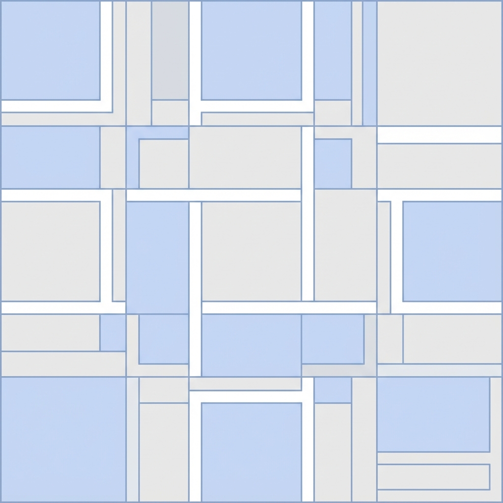
Analyzing Top UI Patterns
When we analyze the UI patterns found in the UI Encyclopedia, we see Grid being used in:
1. Dashboard Layouts
Dashboards often require rigid structures to display dense data. Grid allows for precise placement of widgets, charts, and tables. By defining grid-template-areas, you can shift the layout from a 3-column desktop view to a single-column mobile view seamlessly.
2. Gallery Views
For image-heavy applications, 'Masonry' style layouts (often approximated with Grid) provide an organic feel. While creating true masonry requires JavaScript, CSS Grid can achieve dense packing that looks incredibly polished.
Best Practices for 2026
- Subgrid: Now widely supported, allows nested grids to align with the parent grid tracks, ensuring deep-level alignment consistency.
- Performance: Grid is performant, but avoid excessive nesting.
- Accessibility: Ensure visual order matches DOM order to keep screen readers happy.
Conclusion
Mastering CSS Grid is not just about learning syntax; it's about shifting your mental model of layout. It empowers you to build the complex, adaptive interfaces that modern users expect. Dive into our UI Encyclopedia to see these principles applied in real-world templates and layouts.