Dark Mode Design: Implementation Strategies for 2026
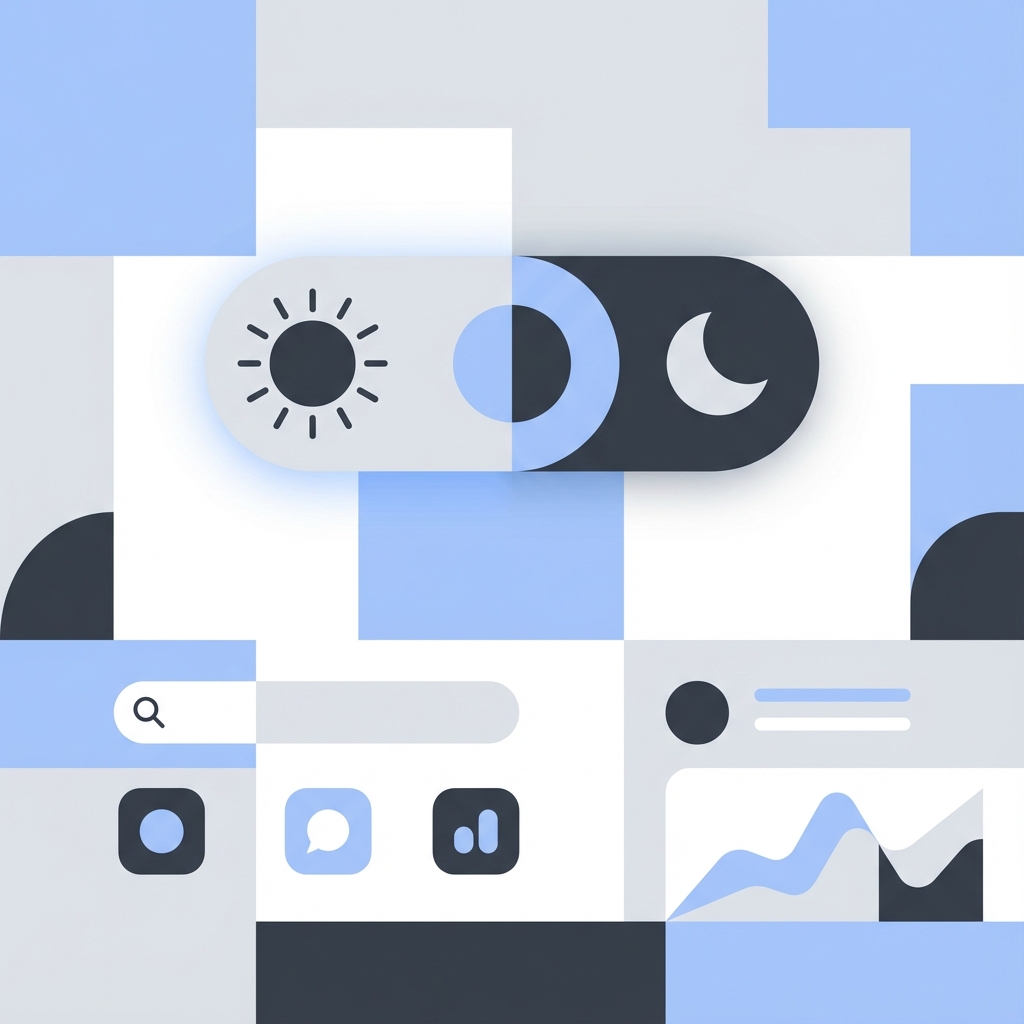
Once a niche feature for developers, Dark Mode is now a standard user expectation across all operating systems and applications. Implementing it correctly goes beyond just inverting colors—it requires a thoughtful approach to palette selection and contrast.
The Design Challenge
Pure black (#000000) can be jarring on OLED screens and cause "smearing" when scrolling. A better approach is to use very dark greys (e.g., #121212) which feel softer and allow for elevation to be expressed through lighter shades rather than drop shadows.
Elevation in Dark Mode
In light mode, we use shadows to show depth. In dark mode, shadows are invisible against a dark background. Instead, we use overlays: the higher the element is "elevated," the lighter its background surface becomes.
Implementation: The CSS Variables Approach
The most robust way to handle themes is CSS Custom Properties.
:root {
  --bg-primary: #ffffff;
  --text-primary: #121212;
}

[data-theme='dark'] {
  --bg-primary: #121212;
  --text-primary: #ffffff;
}

body {
  background-color: var(--bg-primary);
  color: var(--text-primary);
}
Controlling it with Tailwind CSS
Tailwind makes this seamless with the dark: modifier.
<div className="bg-white dark:bg-zinc-900 text-black dark:text-gray-100">
  <h1 className="text-2xl font-bold">Hello World</h1>
</div>
To make this work, toggle a class (usually dark) on the <html> or <body> element using a context provider (like next-themes).
System Preference Handling
Always respect the user's operating system choice first.
if (window.matchMedia('(prefers-color-scheme: dark)').matches) {
  // Apply dark mode
}
The next-themes library handles this synchronization automatically, listening for system changes and updating the UI in real-time.
Handling Images and Media
Don't forget visual assets. Bright images can be blinding in dark mode. Consider reducing their opacity slightly or using CSS filters:
img {
  filter: brightness(.8) contrast(1.2);
}
Conclusion
Dark mode improves battery life on OLED screens and reduces eye strain in low-light environments. By treating it as a first-class citizen in your design system, you ensure a polished experience for all users.