Choosing the Right Font: A Guide to Typography in UI
If you strip away images, colors, and layout, the web is essentially text. Therefore, typography is the most potent tool in a UI designer's arsenal. In our UI Encyclopedia, we emphasize typographic hierarchies that guide the user's eye effortlessly.
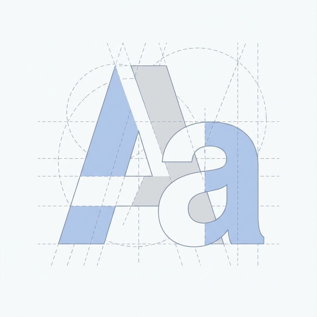
Serif vs. Sans-Serif
- Sans-Serif (e.g., Inter, Roboto, Helvetica): Clean, modern, and highly legible on screens. Ideally suited for UI elements, navigation, and app interfaces.
- Serif (e.g., Merriweather, Playfair Display): Traditional, authoritative, and elegant. Great for long-form reading (blogs) or creating a premium brand feel in headers.
Establishing a Type Scale
Avoid picking font sizes randomly. Use a modular scale (like a Perfect Fourth or Major Third) to create harmonious relationships between your headings and body text.
Example Scale:
- H1: 4rem (64px)
- H2: 3rem (48px)
- H3: 2.25rem (36px)
- Body: 1rem (16px)
- Caption: 0.875rem (14px)
Tailwind CSS provides a great default scale (text-lg, text-xl, etc.) that follows these principles.
Line Height (Leading) and Line Length
- Height: Good leading improves readability. For body text, a line-height of 1.5 (150%) is standard. Headings can be tighter (1.1 or 1.2).
- Length: Lines that are too long tire the eye. Aim for 45-75 characters per line. This is why standard blog containers (like this one) are usually max-width constrained (~65ch).
Font Pairing
Limit your project to 1 or 2 typefaces.
- Workhorse Sans: Use a versatile sans-serif (like Inter) for everything. It works.
- Contrast Pair: Use a distinct Serif for Headings and a clean Sans for body.
Variable Fonts
In 2026, Variable Fonts are standard. They allow you to bundle multiple weights and clear styles into a single file, reducing HTTP requests and allowing for fluid animation of font-weight (e.g., becoming bolder on hover) without layout shifts.
Conclusion
Typography dictates the "voice" of your interface. A bold, geometric font says "loud and tech-forward," while a delicate serif says "refined and classic." Choose wisely.