Building Scalable Systems with Atomic Design Principles
When managing a repository as vast as our UI Encyclopedia, structure is everything. Atomic Design, a methodology coined by Brad Frost, provides a clear mental model for creating design systems. It uses a biological metaphor to explain the relationships between components.
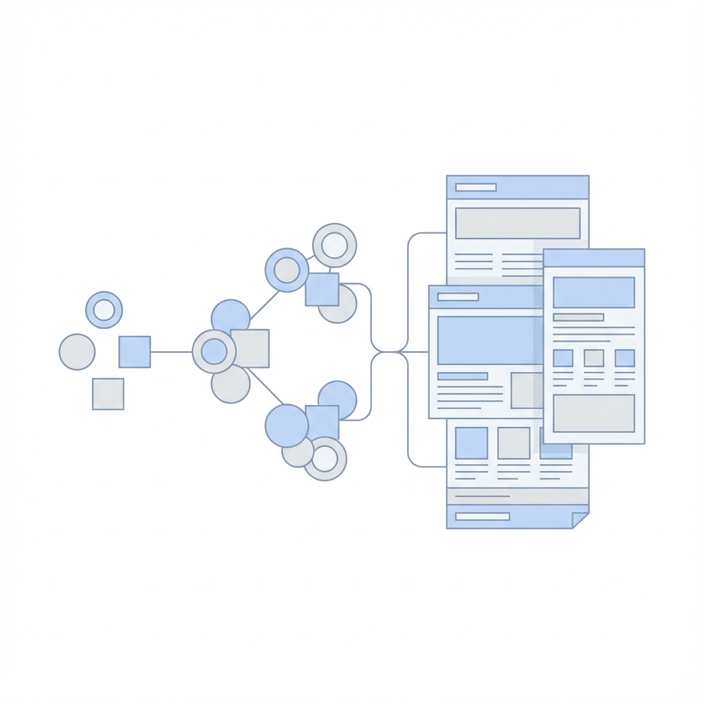
The 5 Stages
- Atoms: The basic building blocks. They cannot be broken down further without losing function.
- Examples: A generic HTML button, an Input field, a Label, a Color palette, a Font.
- Molecules: Groups of atoms bonded together to form a functional unit.
- Example: A "Search Form" (Input atom + Button icon atom + Label atom).
- Organisms: complex UI components composed of groups of molecules and/or atoms and/or other organisms.
- Example: A "Header" (Logo atom + Navigation molecule + Search form molecule).
- Templates: Page-level objects that place components into a layout and articulate the design's underlying structure.
- Example: A "Dashboard Template" showing where the Header and Sidebar go, with dummy content.
- Pages: Specific instances of templates that show what a UI looks like with real representative content.
Applying this to React & Tailwind
In a React codebase, this structure helps organize your components directory:
src/
  components/
    atoms/
      Button.tsx
      Input.tsx
      Avatar.tsx
    molecules/
      UserCard.tsx (uses Avatar + Labels)
      SearchBar.tsx (uses Input + Button)
    organisms/
      Navbar.tsx (uses SearchBar + UserCard)
      Footer.tsx
    templates/
      DashboardLayout.tsx
Benefits
- Reusability: You spot duplicate logic easily. If five different cards use the same button style, that Button should be an atom.
- Consistency: Changing the Button atom updates every Molecule and Organism that uses it.
- Clarity: New developers know exactly where to look for specific components.
Conclusion
Atomic Design is not a rigid rulebook but a helpful heuristic. It encourages you to think of your UI as a system of interconnected parts rather than a collection of disparate pages.